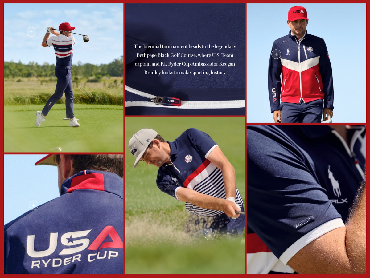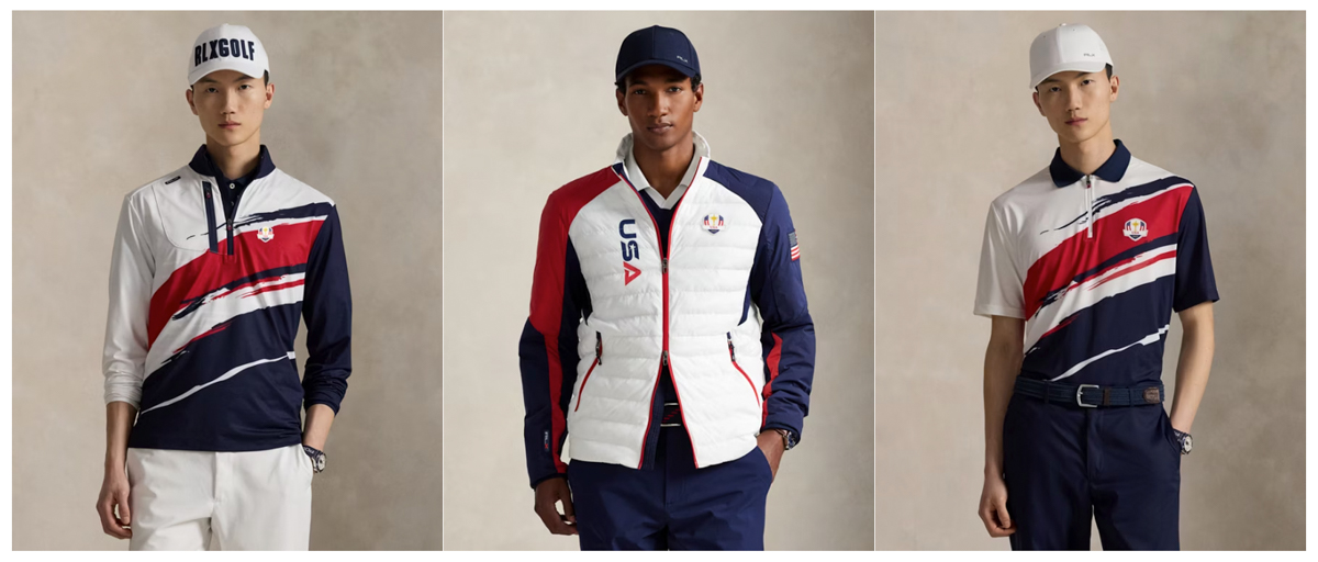
Every two years, golf fans circle the Ryder Cup on the calendar. The competition is electric, the stakes are high, and the pride of wearing your country’s colors should mean something. But let’s be honest: when it comes to style, the U.S. team has been losing before the first tee shot for years. And 2025 doesn’t look much better.
The Ryder Cup is supposed to be about heritage, tradition, and national identity. Look across the pond at the Europeans — they’ve got it figured out. Their looks are tailored, understated, and respectful of the moment. They walk out looking like a team you don’t want to mess with. Meanwhile, Team USA too often looks like it just walked off a clearance rack at Dick’s Sporting Goods.
And not just on the course. At dinner on Tuesday night, the USA team was wearing dark suits, no ties, and white tennis shoes. I’m assuming they lost a bet, or they all came in last place in their respective Fantasy Football leagues.
Somewhere along the line, the U.S. decided that the Ryder Cup uniform had to scream “AMERICA” as loudly as possible — stars, stripes, red-white-and-blue overload, logos on top of logos. It’s like a Fourth of July cookout gone wrong. Subtlety? Gone. Taste? Questionable. Tradition? Lost in the mix. Classic case of OVERDESIGN:

Golf is a sport that thrives on clean lines and timeless looks. Navy blazers. Crisp whites. Muted plaids. But the U.S. keeps rolling out polos with more going on than a NASCAR hood. Busy stripes, clashing colors, and fits that rarely flatter even the fittest players in the world. Instead of intimidating the competition, it makes the team look like a corporate outing sponsored by a flag-print catalog.

What Team USA Should Look Like
It’s not complicated. Keep it simple. A navy and white palette with subtle red accents. Sharp tailoring. Blazers that fit like they were made for the man wearing them. Polos that don’t distract from the game. Hats that honor the sport’s heritage instead of looking like giveaway swag.
Think about the opportunities missed: nods to Payne Stewart’s elegance, Ben Hogan’s sharp minimalism, or even the varsity-inspired looks of Arnold Palmer’s era. Instead, we get tech-heavy fabrics with gimmicky graphics that will look dated before the closing ceremonies. It’s hard to inspire pride in a uniform that feels more like marketing material than tradition.
Imagine the U.S. walking onto the first tee in perfectly cut navy trousers, white polos with a discreet crest, and clean leather shoes. Simple. Classic. Timeless. That’s how you honor the Ryder Cup — not with gimmicks, but with respect for the moment and the game.
How would you suggest the team be outfitted? What brands?

The only guy who can pull off tennis shoes with a suit is Forrest Gump.
What’s weird is that Ralph Lauren, the stalwart of heritage American apparel, designed the uniforms.
While I’m willing to bet the USA team has absolutely no say in what they wear this week, Team USA consistently going for “loud brash American” look is tiresome.
The only thing more tacky than the USA team’s uniform will be the awesome display of t-shirt wearing, beer-soaked, overweight New Yorkers on the course.
Paging Sid Mashburn…..
“The only guy who can pull off tennis shoes with a suit is Forrest Gump.”
…Literally made me laugh out loud. So true, though.
Totally agree on paging Sid. Looking at the weather forecast with his knowledge of fabrics, he could have designed and developed a classic clean look fitting of the Ryder Cup. The no tie and tennis shoes was not good. The Europeans totally won that night.
Author
Seriously.
How hard would it be to do this:
White hat > Red Shirt > Khaki pants
Navy hat > White Shirt > Navy pants
Red hat > Navy shirt > khaki pants
Add a fun belt w/ flags.
Walker Cup Uniforms > Ryder Cup Uniforms.
If they just copied the Walker Cup, we’d be talking about how good of a job they did instead.
Amen to this. I saw the dinner outfits online and was not impressed. The wives looked good. If we get our asses handed to us by the euros again we’re all going to look back and say maybe we should dress up a little more and not act like this is the fellas from local 134 coming down from Chicago to Myrtle Beach for a golf weekend
Author
‘local 134’. Perfect analogy. Love the boys golf trip, but the Ryder Cup look is a little different.
100% spot on. How RL can create timeless clothes, in general, and continue to put out these hideous Ryder Cup uniforms is beyond me. Whoever signs off on these should be fired with cause. They need to move away from RL…what Peter Millar did for the Walker Cup this year was A+, and B. Draddy did a great job with the last Presidents Cup uniforms. Move to one of those two companies, or better yet, to H&B. Thank you for your attention to this matter.
Author
Rumor that this is the LAST year of the RL contract. I’d be shocked to see them re-up.
Shake down the Walker Cup and do everything they do, top to bottom.
Author
Hard to argue against that. Those boys looked GREAT.
I think the attire got tossed down to the Chaps division. Hideous.
Sid Mashburn would slay this assignment. Hell, I think anyone who reads this blog could. How hard is it to keep it simple with solids and strips while using your belt game to bring some flare? Hell, if you want to go “snazzy” then go white polo shirt with red, white, and blue madras pants paired with white and navy saddle golf FootJoys. Throw in a white or navy Tour visor for kicks. Although, Cantlay wouldn’t wear it.
I think you look no further than Jack, Arnold, maybe Payne Stewart. Is taking it a little far.
The other day a post asked the question: is flyfishing a sport or a hobby. Without a doubt golf is a sport, but it doesn’t command athletic wear especially stretchy synthetics. Good tailoring should suffice.
Style whispers, fashion shouts. Seems Team USA is losing the volume battle.
RL needs to be gone. They dial it in every time with the “track-suit-by-numbers” kit. Garbage. Embarrassing.
Zippers on the polos and “USA” on the leg of the pants makes it a no for me dawg…